The Ultimate Guide to Interior Design

Welcome to the definitive exploration of interior design – a discipline that transcends mere aesthetics to shape human experience, enhance well-being, and define the very essence of how we live, work, and connect within our built environments.
This guide is for the discerning mind – whether you are an aspiring designer, a seasoned professional seeking deeper insights, or a homeowner embarking on a significant transformation. It is crafted to peel back the layers of our craft, revealing the foundational principles, strategic processes, and nuanced considerations that culminate in truly timeless and impactful interiors. We will journey from the philosophical "why" of design to the granular "how" of material selection, from the psychological power of colour to the meticulous choreography of project management.
You'll discover that at Gianna D'Art, our approach is rooted in the belief that design is a holistic endeavour. It’s about understanding human behaviour, respecting architectural integrity, embracing sustainable practices, and creating spaces that don't just look exquisite, but feel inherently right. We believe in the power of timeless luxury – an enduring quality born from thoughtful planning, meticulous craftsmanship, and a profound appreciation for detail. This guide is your compass through that philosophy, a roadmap to understanding the comprehensive art that is interior design.
From the foundational theories of proportion and scale to the practicalities of working with trades and the subtle artistry of styling, we will explore every facet of this dynamic profession. Prepare to delve into the very fabric of space, light, and form, and uncover the ultimate secrets to crafting environments that are not just beautiful, but profoundly reflective of the lives lived within them.
Part 1: The Philosophy and Purpose of Interior Design
1.1 Defining Interior Design: Beyond Decoration to Transformation

The term "interior design" is often, and sometimes reductively, conflated with "interior decoration." While both disciplines operate within the same physical spaces and share an appreciation for aesthetics, their scope, methodology, and ultimate objectives differ fundamentally. Decoration, at its core, involves the embellishment of an existing space—the application of finishes, furniture, and accessories to enhance visual appeal. It focuses primarily on the surface, on the 'what' of a room.
Interior design, however, is a far more expansive and strategic undertaking. It is a multi-faceted discipline that delves into the very essence of a space, moving beyond superficial aesthetics to address its functionality, safety, and the inherent human experience within it. As Francis D.K. Ching eloquently puts it, architecture (and by extension, interior design) is the "inevitable art of making places for human purpose" [Ching, 2014]. Our role as interior designers is to craft environments that are not merely beautiful to behold, but which actively support and enhance the lives lived within them.
This distinction is crucial. When we approach an interior, we don't just ask, "What colour should the walls be?" We begin with foundational inquiries: How will this space be used? Who are its inhabitants, and what are their unique needs, routines, and aspirations? How does natural light interact with the volume of the room? Are there structural elements that can be optimised or reimagined? This holistic perspective necessitates a blend of creative vision and meticulous strategic planning, a dance between art and science.
Art vs. Science: The Dual Nature of the Discipline
The artistic facet of interior design lies in its capacity for aesthetic expression, the intuitive understanding of beauty, composition, and sensory experience. It involves the creative vision to conceive unique palettes, harmonise diverse textures, and sculpt light to evoke specific moods. This is where intuition, passion, and a cultivated eye for design principles converge to transform abstract concepts into tangible, inspiring environments.
Conversely, the scientific dimension is rooted in empirical knowledge and systematic application. This encompasses a deep understanding of human factors and anthropometrics (the study of human body measurements, ensuring comfort and accessibility), building codes and regulations (guaranteeing safety and compliance), material science (understanding durability, sustainability, and performance), and environmental psychology (how design influences human behaviour and well-being).
It is the rigorous application of these scientific principles that underpins the art, ensuring that a design is not just beautiful, but structurally sound, functionally efficient, and ergonomically optimised [Panero & Zelnik, 1979]. The integration of these two realms is what elevates interior design to a truly professional discipline, delivering solutions that are both aesthetically profound and inherently intelligent.
The Designer's Role: Visionary, Strategist, Curator, Project Manager
The modern interior designer's role is expansive and multifaceted. We are:
-
Visionaries: Conceiving transformative concepts that breathe new life into spaces.
-
Strategists: Developing comprehensive plans that address functionality, flow, and budget.
-
Curators: Sourcing unique materials, furniture, and art, ensuring every element tells a cohesive story.
Ultimately, interior design is the deliberate act of shaping space to enrich human existence—a profound transformation that extends far beyond surface decoration.
Project Managers: Overseeing the intricate execution, coordinating trades, and navigating complexities to deliver seamless results.
1.2. The Human Element: How Design Impacts Well-being
At its core, interior design is a human-centric discipline. While aesthetics are undeniably vital, the true measure of a successful interior lies in its capacity to foster human well-being, enhance cognitive function, and evoke desired emotional responses. Our environments are not neutral backdrops; they are active participants in shaping our experiences, influencing everything from our stress levels to our productivity, our mood to our quality of sleep. This profound impact is rooted in environmental psychology, a field dedicated to understanding the intricate relationship between people and their surroundings.
Psychology of Space: Mood, Cognition, and Behaviour
The way a space is designed—its layout, lighting, colour palette, and acoustics—can profoundly influence our psychological state and even our behaviour. Research consistently demonstrates that well-designed spaces can:
-
Reduce Stress and Anxiety: Environments that feel safe, ordered, and aesthetically pleasing can lower cortisol levels and promote relaxation. Biophilic design, for instance, by integrating natural elements, has been scientifically linked to reduced physiological stress responses [Park et al., 2010].
-
Enhance Cognitive Performance: Spaces with optimal lighting, controlled acoustics, and a clear sense of organization can improve concentration, memory retention, and overall productivity. Conversely, cluttered or chaotic environments can increase cognitive load and reduce focus [Princeton University, 2011].
-
Influence Mood and Emotion: As discussed in our exploration of Colour Theory, hues carry strong psychological associations, directly influencing feelings of energy, calm, comfort, or stimulation [Itten, 1961]. Beyond colour, the perceived scale of a room can evoke grandeur or intimacy; natural light can uplift or soothe.
-
Shape Social Interaction: The spatial arrangement of furniture dictates flow and encourages specific types of interaction—a tightly grouped seating area fosters intimacy, while an expansive open plan might promote more fluid, casual gatherings.
Sensory Experience: Engaging All the Senses (Sight, Touch, Sound, Scent)
While interior design is predominantly a visual discipline, a truly immersive and effective space engages all the senses, creating a richer, more holistic experience. Neglecting these non-visual elements results in environments that feel sterile or incomplete [Pallasmaa, 2005].
By intentionally designing for these sensory layers, we transcend mere decoration, crafting environments that are deeply intuitive, restorative, and profoundly human.
-
Sight: This is our most dominant sense in design, encompassing colour, light, line, shape, form, pattern, and texture. The interplay of these elements creates the visual narrative of the room. Optimal lighting design, both natural and artificial, is paramount to how we perceive every other visual element.
-
Touch (Tactile Experience): The physical feel of surfaces adds immense depth and comfort. The plushness of a velvet sofa, the coolness of polished stone, the roughness of raw wood, the crispness of linen—these tactile qualities invite interaction and make a space feel richer and more authentic.
-
Sound (Acoustics): The acoustic quality of a room significantly impacts its perceived comfort and functionality. Hard surfaces (glass, tile) can lead to echo and noise; soft furnishings (rugs, thick curtains, upholstered furniture) absorb sound, creating a quieter, more intimate atmosphere crucial for conversation and relaxation. Poor acoustics can contribute to stress and fatigue.
-
Scent (Olfactory Experience): Often overlooked, scent has a powerful, often subconscious, link to memory and emotion. A subtle, natural scent from fresh flowers, diffused essential oils, or the inherent aroma of natural wood can contribute to a home's unique character and inviting ambiance. Avoiding unpleasant odours is equally important.
Part 2: The Core Principles of Design:
The Language of Space
Understanding interior design is akin to learning a language. Just as words form sentences and sentences form narratives, a set of fundamental principles acts as the vocabulary and syntax for creating compelling spaces. These principles—Line, Shape, Form, Colour, Texture, Space, Balance, Rhythm, and Emphasis—are not arbitrary rules, but universal guidelines derived from human perception, aesthetics, and functionality. They are the invisible forces that shape our experience of the built world, dictating comfort, mood, and visual coherence.
In this section, we will systematically unpack each of these pillars. By delving into their individual properties and understanding how they interact, we gain a sophisticated vocabulary to speak the nuanced language of interior design, moving beyond superficial aesthetics to appreciate the profound artistry and strategic intelligence that underpins every truly exceptional interior.
The most fundamental elements of visual composition, Line, Shape, and Form, are the foundational grammar through which all spatial narratives are constructed. They dictate the underlying structure, define visual pathways, and profoundly influence the emotional resonance of an interior. While often operating subconsciously on the viewer, their deliberate orchestration by a designer transforms a mere collection of furnishings into a cohesive, purposeful, and profoundly impactful environment. At Gianna D'Art, understanding and mastering these elements is paramount to crafting spaces that are not only beautiful but also enduringly harmonious and functional.
Line: The Directional Force
Line is the most basic visual element, defined as a point moving through space. In interior design, lines are omnipresent—they delineate boundaries, guide the eye, and convey a profound sense of direction and emotion. [Lauer & Pentak, 2012]
-
Horizontal Lines: Found in elements like low-slung sofas, long tables, and dado rails. They typically evoke a sense of stability, restfulness, and breadth, grounding the space.
-
Vertical Lines: Present in tall windows, columns, bookcases, and high ceilings. They impart a feeling of grandeur, height, formality, and strength, drawing the eye upwards.
-
Diagonal Lines: Seen in staircases, vaulted ceilings, or a strategically placed leaning mirror. These lines introduce dynamism, movement, and visual energy, creating a sense of action.
-
Curved Lines: Found in arched doorways, rounded furniture, or the flow of a spiral staircase. They convey softness, fluidity, grace, and a sense of inviting movement, often reducing the formality of rectilinear spaces. [Ching, 2014]
Significance: Lines establish the foundational structure and dictate the visual pathways within a room, profoundly influencing its perceived mood and scale.
Shape: The Two-Dimensional Outline
A shape is a two-dimensional outline, created when lines connect and enclose an area. Shapes define the basic contours of objects and architectural elements, contributing significantly to a room's aesthetic identity and overall harmony or contrast.
-
Geometric Shapes: Predominantly composed of straight lines and sharp angles (rectangles, squares, triangles) or perfect curves (circles, ovals). These evoke order, structure, and modernity. A rectilinear sofa, a square coffee table, or a round rug are examples.
-
Organic/Natural Shapes: Characterized by soft, irregular, and often curvilinear forms found in nature (e.g., the silhouette of a tree, a pebble, or a cloud). These shapes introduce softness, fluidity, and a more relaxed, approachable feel. They can provide a calming counterpoint to geometric regularity.
Significance: Shapes contribute to visual rhythm and pattern. A consistent use of specific shapes can create unity, while a deliberate contrast in shapes can generate visual interest and focal points.
Form: The Three-Dimensional Presence
Form is the three-dimensional manifestation of shape; it possesses depth, mass, and volume. It's how an object occupies and defines space, making it a tangible presence within an interior. [Ching, 2014]
-
Mass: Refers to the perceived visual weight or physical bulk/density of an object. A solid, dark wood cabinet possesses significant mass.
-
Volume: Refers to the space an object occupies or encloses, which can be 'solid' (like a block) or 'void' (like a hollow sphere). A hollow vase, while having less physical mass, still occupies volume.
-
Actual Form: The physical, tangible presence of an object (e.g., a chair, a sculpture).
-
Implied Form: How a two-dimensional image or pattern suggests a three-dimensional quality (e.g., a patterned wallpaper creating the illusion of texture or depth).
Significance: Forms define the physical landscape of a room. The interplay of positive form (the objects themselves) and negative space (the empty areas around and between them) is crucial for comfortable circulation and visual balance. [Hall, 1966]
The Interdependence: Orchestrating the Composition
These three elements are intrinsically linked and interdependent. Lines define the boundaries of shapes, and shapes are the outlines that give rise to three-dimensional forms. A designer's mastery lies in orchestrating this interplay:
-
A vertical line in a window frame leads to the rectangular shape of the window, which frames a three-dimensional view (form) of the outside.
-
The curved lines of an armchair define its organic shape, which in turn creates its inviting, volumetric form.
By consciously manipulating these core elements, we create rooms that are not just beautiful, but conceptually sound—spaces that tell a compelling visual story through their very structure.
Having explored the foundational elements of Line, Shape, and Form, we now turn to perhaps the most immediately impactful and emotionally resonant element in interior design: Colour. Its power extends far beyond mere aesthetic preference, influencing our very perception and experience of a space.
2.1. Line, Shape, and Form:
The Architectural Building Blocks of Interior Spaces

Part 2: The Core Principles of Design:
The Language of Space
2.2. Colour Theory: Psychology, Palettes, and Practical Application in Design
Colour is the most potent, and often the most emotional, tool in an interior designer’s arsenal. It sets the stage, defines the mood, and profoundly influences our psychological and even physiological responses to a space. It can enlarge or diminish, energize or calm, conceal or highlight. Yet, selecting the perfect palette is far more nuanced than simply choosing a favourite hue. It is an art informed by science—the profound study of Colour Theory.
Understanding how colours interact, their inherent psychological associations, and how they behave under different lighting conditions transforms a subjective preference into a strategic design decision. It equips the designer with the vocabulary to craft not just visually appealing rooms, but environments that evoke specific feelings and support desired behaviours. At Gianna D'Art, we wield the power of colour theory to craft interiors that are not only aesthetically captivating but also deeply resonant, emotionally intelligent, and enduringly timeless.
Long before a single piece of furniture is placed, the chosen colour palette begins its silent, yet powerful, conversation with the inhabitant. Every hue carries a rich tapestry of psychological associations, influenced by culture, biology, and individual experience. Decades of research in environmental psychology unequivocally confirm the profound impact of colour on human emotion and behaviour [Birren, 1961; Itten, 1961].
-
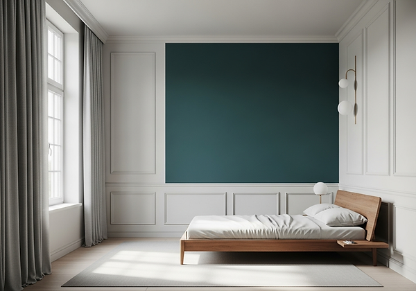
Warm Colours (Reds, Oranges, Yellows): These are stimulating, advancing, and expansive colours. They tend to evoke feelings of energy, warmth, passion, and comfort. Red, for instance, can signify excitement or warmth, while yellow often conveys happiness and optimism. Due to their advancing nature, warm colours can make a large room feel more intimate and inviting. They are ideal for social spaces like living rooms, dining rooms, and kitchens, or to add vital warmth to cooler climates or north-facing rooms.
-
Cool Colours (Blues, Greens, Purples): These are calming, receding, and often introspective colours. They tend to evoke tranquility, serenity, professionalism, and freshness. Blue is widely associated with calm and stability, while green often suggests nature, balance, and renewal. Their receding nature can make a small room feel more expansive and airy. These are perfect for private, restorative spaces like bedrooms, bathrooms, focused workspaces, or to bring a sense of coolness to sun-drenched rooms.
-
Neutrals (Greys, Whites, Blacks, Browns): These form the foundational, often grounding, elements of a palette. They are incredibly versatile and provide a sophisticated backdrop against which other colours can pop, or they can create a serene, minimalist, and monochromatic feel on their own. Their apparent simplicity belies a rich complexity; their underlying undertones (warm, cool, or subtle tints of other colours) are critical for ensuring harmony within a scheme. Neutrals lend sophistication and allow for flexibility in accenting.
Significance: By understanding these inherent psychological properties, we can intentionally manipulate the mood, perceived scale, and functional suitability of a space, tailoring it to your desired emotional and practical experience.
Beyond individual colour psychology, true artistry in interior design emerges in how colours are combined to form a cohesive and pleasing palette. The colour wheel, a conceptual tool developed to illustrate relationships between colours, provides a fundamental framework for these harmonious compositions, forming the basis of enduring design [Albers, 1963; Itten, 1961].
-
Monochromatic Schemes: These utilize varying shades, tints, and tones of a single colour. For instance, a room painted in light blue, with a sofa in a slightly deeper blue, and cushions in a pale blue. This approach creates sophisticated, subtle, and incredibly calming spaces. Depth is achieved not through stark contrast, but through variations in lightness (tints, adding white), darkness (shades, adding black), and intensity (tones, adding grey), often heavily relying on texture to provide visual interest.
-
Analogous Schemes: These combine colours that are adjacent on the colour wheel (typically 2-4 colours). For example, blue, blue-green, and green. Such schemes are found frequently in nature and inherently produce serene, harmonious, and sophisticated aesthetics. They offer more variety than monochromatic schemes without sacrificing unity.
-
Complementary Schemes: These pair colours directly opposite each other on the colour wheel (e.g., blue and orange, red and green, yellow and purple). They create the highest contrast and visual dynamism, generating energy and excitement. Due to their intensity, complementary schemes demand careful balance and often work best when one colour is dominant and the other is used sparingly as an accent.
-
Triadic Schemes: These use three colours equally spaced on the colour wheel (e.g., red, yellow, and blue; or orange, green, and purple). Such schemes offer vibrant, balanced, and playful compositions. Like complementary schemes, they require careful management to avoid overwhelming the eye, often by allowing one colour to dominate and using the others as accents.
-
Split-Complementary/Tetradic Schemes: These are more complex derivations that offer rich variety while maintaining harmony. A split-complementary scheme uses a base colour and the two colours adjacent to its complement (e.g., blue, and then red-orange and yellow-orange). Tetradic schemes use two pairs of complementary colours. These sophisticated structures provide immense potential for depth and visual richness, often seen in eclectic or richly layered designs.
Significance: Understanding these underlying structures enables the creation of palettes that are either soothingly unified or vibrantly dynamic, always with an underlying sense of order and intentionality.
Translating the principles of colour theory from abstract concepts to living, breathing spaces requires meticulous attention to a range of practical, real-world factors. The true artistry of a designer emerges in navigating these nuances to ensure the chosen palette performs optimally within its unique context.
-
The Influence of Light: Colour is profoundly dynamic; it changes dramatically under different lighting conditions. [Goethe, 1810]
-
Natural Daylight: Varies significantly by direction (north, south, east, west) and time of day. North-facing rooms receive cooler, bluer light, making colours appear more muted. South-facing rooms are bathed in warm, golden light, intensifying colours. East-facing rooms get bright morning light, while west-facing rooms receive warm afternoon glow.
-
Artificial Light: Different light temperatures (measured in Kelvin, K) cast different hues. Warm artificial light (2700K-3000K) has more yellow/orange, enhancing warm colours and muting cool ones. Cooler artificial light (4000K+) has more blue, making colours appear crisper and brighter, often accentuating cool tones.
We rigorously test colours in situ, applying large swatches to different walls within the same room and observing them at various times of day and under planned artificial illumination. This iterative process ensures the chosen hue performs beautifully at all hours, not just under the controlled conditions of a showroom.
-
-
The Power of Undertones: This is perhaps the most sophisticated aspect of colour selection, separating the amateur from the expert. Almost every seemingly "neutral" or "pure" colour possesses a subtle undertone—a hint of red, blue, yellow, green, or purple. For instance, a grey might have a blue undertone (making it cool) or a beige undertone (making it warm). Mismatching these undertones across different elements (wall paint, upholstery fabric, wood finishes, stone) can lead to a disharmonious, almost jarring, result that is difficult to pinpoint but deeply felt. Our expertise ensures that all components of a design, from major surfaces to the smallest accessory, speak the same subtle colour language through aligned undertones, creating a seamless and profoundly cohesive feel.
-
Colour Drenching: A powerful and increasingly popular technique where walls, skirting boards, architraves, door frames, and even ceilings are all painted in the exact same, single, deep, sophisticated colour. Far from being overwhelming, this immersive approach blurs the architectural boundaries of the room, creating an incredibly elegant, cocoon-like effect. It adds remarkable depth, emphasizes texture, and transforms the space into a unified, enveloping experience. It is a bold statement of confidence and refinement.
-
The 60-30-10 Rule: A classic guideline for distributing colour proportions within a room to achieve visual balance and rhythm.
-
60% Dominant Colour: Used for large areas like walls, flooring, and major pieces of furniture (e.g., sofas). This sets the overall mood.
-
30% Secondary Colour: Applied to upholstery, curtains, accent furniture, or a feature wall. This provides contrast and interest without overwhelming.
-
10% Accent Colour: Reserved for smaller decorative items like cushions, throws, artwork, or accessories. This provides pops of excitement, personality, and can be easily changed to refresh the scheme. While a guideline, it encourages thoughtful distribution.
-
Significance: These practical considerations ensure that the theoretical palette translates into a living, breathing environment that delights the eye, supports well-being, and retains its integrity through various conditions.
Colour is the emotional heart of an interior. It is the immediate sensory impression, the subtle whisper of mood, and the vibrant articulation of personality. By moving beyond arbitrary preferences and embracing the profound principles of colour theory—understanding its psychology, mastering harmonious combinations, and navigating its practical applications—we transform spaces from mere arrangements of objects into sophisticated, emotionally intelligent environments.
Having meticulously explored the foundational principles of Line, Shape, and Form, and the evocative power of Colour Theory, we now turn to a vital, yet often subtle, element that truly invites interaction and adds profound depth to an interior: Texture.
1. The Psychology of Colour: How Hues Speak to Us
2. Building Harmonious Palettes: The Language of Combination
3. Practical Application: Mastering the Nuances of Colour in Design
Crafting Emotion Through Intentional Colour


Part 2: The Core Principles of Design:
The Language of Space
2.3. Texture: Adding Depth and Sensory Experience to Interiors
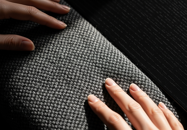
Imagine walking into a room. Your eyes register the colours, the shapes of the furniture, and the way the light falls. But then, almost unconsciously, another sense activates. You feel an innate desire to reach out and touch the velvet sofa, to run your hand across the cool smoothness of the marble tabletop, or to feel the inviting roughness of a natural rug beneath your feet. This profound, often subconscious, desire to engage beyond mere sight is the testament to the powerful, often understated, role of texture in interior design.
Texture refers to the perceived surface quality of a material – how it looks like it would feel, and how it actually feels to the touch [Pile, 2013]. In sophisticated interior design, texture is far more than a decorative afterthought; it is a fundamental design element that adds critical depth, visual interest, and a vital sensory dimension to a space. It’s the element that truly engages the inhabitant, transforming a room from merely beautiful to profoundly inviting, comforting, and enduringly tactile. At Gianna D'Art, we understand that mastering the interplay of textures is key to crafting interiors that are not only visually captivating but also deeply immersive and inherently luxurious.
Texture manifests in two primary forms within the designed environment, both contributing significantly to the overall sensory experience:
-
Tactile (Actual) Texture: This is the physical, verifiable feel of a surface. It's the sensation you experience when you physically interact with a material – the yielding softness of cashmere, the abrasive roughness of raw brick, the refreshing coolness of polished stone, or the coarse, yet inviting, grit of natural linen. Tactile texture offers a direct, haptic connection to the material, providing immediate sensory feedback. It evokes a primal response, influencing comfort, safety, and psychological well-being [Pallasmaa, 2005].
-
Visual (Implied) Texture: This is the perception of texture solely through sight, even if the surface itself is smooth to the touch. It's the illusion of texture created by patterns, specific colour variations, or the way light interacts with a seemingly flat surface. A wallpaper that meticulously mimics the look of raw concrete or woven grasscloth, a detailed photograph of a textured fabric, or the intricate grain pattern of a laminate floor are prime examples of visual texture. While it doesn't offer a direct tactile experience, visual texture effectively adds depth and interest, contributing to the perceived richness of a design.
Significance: Both forms of texture are crucial. While tactile texture offers a profound, direct sensory connection that grounds the inhabitant within the space, visual texture provides depth and complexity, preventing monotony and adding layers of visual intrigue even from a distance. The masterful integration of both creates a truly immersive environment.
A room designed with a singular, uniform texture, or one devoid of varied tactile experiences, risks feeling flat, cold, and one-dimensional, even if its colours and forms are otherwise impeccable. Texture addresses several critical design objectives, transforming a space from merely functional to profoundly engaging:
-
Adds Depth and Dimension: Just as a painting uses varied brushstrokes to create depth and movement, varied textures layer an interior. This layering creates visual weight and interest, pulling the eye in and inviting exploration. It prevents rooms from looking like two-dimensional flat sets.
-
Enhances Sensory Experience: Texture directly engages the sense of touch (haptics), making a room feel more immersive, inviting, and inherently comfortable. This tactile connection contributes significantly to psychological well-being and a feeling of grounded-ness, as explored by proponents of embodied cognition and phenomenology in design [Pallasmaa, 2005].
-
Creates Visual Interest and Contrast: Juxtaposing different textures prevents monotony and creates compelling focal points. A sleek, modern sofa becomes more inviting with a chunky knit throw; a rustic wooden table finds new elegance paired with smooth, minimalist chairs. This interplay adds visual dynamism without necessarily requiring bold colour changes.
-
Influences Light and Shadow: Textures profoundly interact with light in distinct ways. A smooth, reflective surface (like polished marble or glass) will bounce and distribute light, often creating a sense of expansiveness or coolness. Conversely, a rough, matte surface (such as raw brick or a deep-pile rug) will absorb light, creating more defined shadows and a sense of warmth, intimacy, and solidity. The way light plays across textures reveals their nuances and adds visual complexity.
-
Contributes to Mood and Warmth: Generally, rougher, softer textures (e.g., wool, linen, raw wood, natural stone) tend to absorb light and sound, lending inherent warmth, comfort, and a sense of approachability. They invite relaxation and create a 'cocooning' effect. In contrast, smoother, harder, or more reflective textures (e.g., glass, metal, polished stone, lacquer) tend to reflect light, evoking coolness, sophistication, and often a sense of modernity or refined classicism.
Significance: Texture transforms a space from a purely visual composition into a rich, sensory environment that appeals to our innate human need for tactile engagement, contributing profoundly to its overall atmosphere and comfort.
The world of materials offers an infinite palette of textures, each with its own inherent characteristics and contributions to a design. At Gianna D'Art, we meticulously select and combine these qualities to orchestrate a rich, tactile experience that speaks to both aesthetics and comfort:
-
Soft & Plush: This category includes materials like velvets, chenilles, mohair, luxurious wools, faux furs, and deep-pile rugs (e.g., shag, cut pile). These textures tend to absorb both light and sound, creating a feeling of profound luxury, deep comfort, and intimate enclosure. They invite physical interaction and add a tactile sensuality to a space.
-
Smooth & Polished: This encompasses surfaces like polished marble, honed concrete, sleek glass, lacquered wood, and highly finished metals (e.g., polished chrome, mirror-finished brass). These materials are highly reflective, bouncing light and creating a sense of spaciousness, coolness, and refined sophistication. They often evoke modernity, precision, and elegant classicism.
-
Rough & Organic: This category features raw or minimally processed materials such as unfinished or reclaimed wood, natural stone (e.g., rough-hewn slate, natural travertine), jute, sisal, coarse linen, exposed brick, and certain types of plaster finishes. These textures absorb light, providing a sense of groundedness, authenticity, and natural beauty. They contribute to a relaxed, earthy, and often rustic or industrial aesthetic, adding a sense of history and connection to the natural world.
-
Crisp & Structured: This describes materials with a precise, defined surface quality. Examples include tightly woven cottons, crisp linens (especially in tailored forms), precise architectural mouldings, and industrial metals (e.g., brushed stainless steel, clean powder-coated aluminium). These textures reflect a clean, ordered, and often minimalist aesthetic, conveying a sense of precision, neatness, and architectural clarity.
Significance: By understanding these distinct textural qualities, designers can intentionally layer them to create specific moods, enhance visual interest, and contribute to the overall balance of a space.
The true artistry of texture in interior design lies not in simply accumulating different materials, but in its strategic orchestration. We aim to establish a harmonious textural base, then judiciously introduce contrasts to create visual excitement, prevent monotony, and add profound depth without overwhelming the senses. This dynamic interplay ensures a room feels both visually engaging and deeply comfortable.
-
Harmony through Repetition and Similarity: This is achieved by using variations of the same texture or textures from similar categories. For instance, designing a room with multiple types of linen (a crisp linen curtain, a softer linen sofa, a textured linen cushion) creates subtle variations that feel cohesive. Similarly, mixing different natural wood tones and types (oak, walnut, ash) can create harmony through their shared organic quality.
-
Contrast through Juxtaposition: This is where the magic of texture truly comes alive, creating visual intrigue and highlights:
-
Smooth vs. Rough: Juxtaposing a highly polished, sleek marble coffee table against a tactile, rough-hewn stone wall or a shaggy wool rug.
-
Soft vs. Hard: Balancing a plush velvet sofa with a sleek, minimalist metal floor lamp. The inviting softness of the seating encourages relaxation, while the hard, clean lines of the lamp provide a structural counterpoint.
-
Matte vs. Glossy: Applying a chalky, light-absorbing matte paint finish on walls behind a reflective, lacquered cabinet or a polished chrome fixture. This creates depth and plays with how light interacts with the surfaces.
-
Open vs. Dense Weave: Pairing a tightly woven, crisp fabric on a dining chair with a loose, airy weave on window sheers.
-
Significance: A thoughtful interplay ensures that a room feels both visually engaging and deeply comfortable, inviting exploration without overwhelming the senses. It makes the room more complex and interesting without necessarily introducing more colour.
Texture is not confined to textiles; it is woven into every layer of our designs, from the foundational elements to the final decorative touches. A comprehensive approach ensures that the entire space contributes to the desired sensory experience:
-
Walls: Beyond a flat paint finish, walls offer immense textural potential. Consider:
-
Textured wallpapers: From grasscloth and linen-backed papers to subtle embossed patterns that create visual texture.
-
Plaster finishes: Limewash offers a soft, chalky, mottled appearance. Venetian plaster provides a smooth, polished sheen with subtle depth.
-
Architectural cladding: Exposed brick, natural stone veneers, or bespoke timber panelling add significant tactile and visual texture, grounding the space.
-
-
Flooring: The choice of flooring sets a fundamental textural tone for the entire room.
-
Hard Flooring: The warmth of wide-plank engineered wood, the cool elegance of polished concrete, the rustic charm of terracotta tiles, or the timeless sophistication of natural stone.
-
Soft Flooring: The plushness of a deep-pile wool carpet, the subtle pattern of a sisal or jute rug, or the luxurious feel of a silk blend area rug.
-
-
Furniture & Upholstery: The tactile quality of a sofa, armchair, or dining chair fabric is paramount for comfort and aesthetic appeal. A crisp, tailored linen will feel and look different from a soft, inviting velvet, or a smooth, durable leather. The frame materials also contribute texture (e.g., polished metal vs. natural wood).
-
Window Treatments: Curtains, blinds, and drapes introduce significant textural elements that soften light, absorb sound, and add warmth. Think of the fluid drape of silk, the structured crispness of a Roman blind in woven linen, or the clean lines of wooden plantation shutters.
-
Accessories: This is where you can easily layer and experiment, adding concentrated pops of texture. Throws, cushions, decorative vases (ceramic, glass, metal), sculptural objects, and art all offer endless textural opportunities to refine and personalize a space. Even the type of lighting (e.g., diffused light through a textured shade vs. sharp light on a smooth surface) contributes.
Texture is the unsung hero of interior design, the element that transforms a visually appealing space into a truly lived-in, deeply comfortable, and profoundly personal sanctuary. It is the sensory signature of your home, inviting touch, creating depth, and enriching every moment spent within its walls.
With the exploration of Line, Shape, Form, Colour, and Texture complete, we now turn our attention to the fundamental, often understated, elements that truly define the functionality and feel of an interior: Space and Mass. These principles dictate how a room breathes, how it allows movement, and how it ultimately makes us feel within its boundaries.
1. Defining Texture: Visual and Tactile Perception
2. Why Texture Matters: Beyond the Flat Surface
3. The Palette of Texture: Exploring Material Qualities
4. Orchestrating Harmony and Contrast with Texture
5. Practical Applications: Weaving Texture Throughout Your Home


Part 2: The Core Principles of Design:
The Language of Space
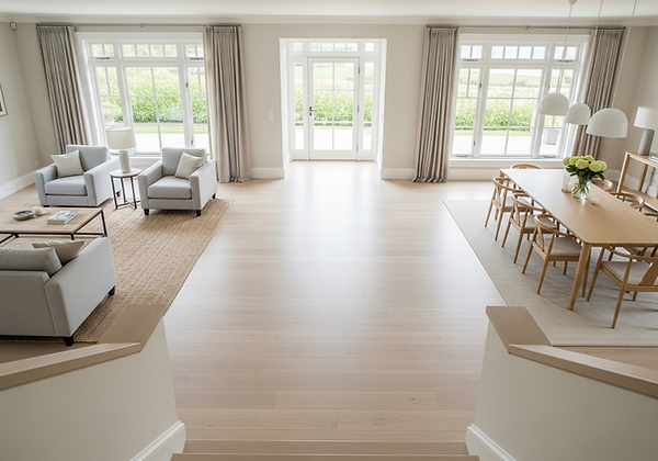
2.4. Space and Mass: Understanding Positive and Negative Space in Design
Imagine stepping into a room. You instantly register the objects – the sofa, the coffee table, the art on the walls. Yet, much of your comfort, and the intuitive ease with which you move through that space, is dictated not merely by what's present, but by what's absent. This is the profound, often unacknowledged, power of Space and Mass in interior design.
Space, in this context, is far more than mere emptiness. It is a fundamental design element, actively shaped and defined by the tangible objects, or Mass, within it. Understanding the dynamic interplay between Positive Space (the areas occupied by objects) and Negative Space (the voids around and between them) is paramount to crafting interiors that are not only aesthetically captivating but also profoundly functional, emotionally resonant, and enduringly comfortable. At Gianna D'Art, we meticulously orchestrate this relationship, ensuring every square foot, both filled and empty, contributes to a harmonious and timeless design.
To master the language of spatial design, it is essential to delineate its primary components:
-
Positive Space (Form): This refers to the areas within a design that are occupied by tangible objects. These are the forms – the furniture, architectural elements (walls, columns, doors, windows), decorative objects, and even patterns on surfaces. They possess mass and visual weight. In Gestalt psychology, this is akin to the "figure" that stands out against the "ground," the solid object that draws attention [Koffka, 1935]. A fully upholstered armchair, a solid dining table, or a large built-in bookcase are examples of positive space.
-
Negative Space (Void): Often described as the "white space" or "breathing room," this is the unoccupied area surrounding and between the positive elements. Crucially, negative space is not merely empty; it is an active, vital design element. It shapes and highlights the positive forms, defines clear pathways for circulation, influences the perceived scale of a room, and directly impacts its mood. It is the un-designed space that paradoxically enables the design to function and resonate. Think of the wall space around a piece of art, the distance between a sofa and a coffee table, or the clear pathway leading into a room.
-
Mass: While intimately related to positive space, mass specifically refers to the perceived visual weight or physical bulk/density of an object. A solid, dark wood cabinet possesses significantly more 'mass' and visual weight than a glass console table of similar dimensions, even if they occupy a comparable amount of positive space. Mass directly influences how 'heavy' or 'light' a room feels, and how much visual space an object demands. A room dense with heavy mass can feel oppressive, while one with too little mass can feel ethereal or unfinished.
Significance: The skilful manipulation of these elements allows a designer to create visual balance, define optimal circulation paths, and precisely control the psychological and functional impact of an interior. It is the spatial choreography that dictates how a room works for its inhabitants.
The dynamic relationship between positive and negative space, constantly modulated by the perceived mass of objects, directly impacts both the functionality and the psychological comfort of a room. This careful orchestration is what distinguishes a truly liveable interior from a mere collection of furnishings.
-
Circulation and flow: Ample, thoughtfully designed negative space is critical for creating clear and intuitive pathways for movement throughout a room. This prevents awkward navigation and ensures ease of access and transition between different zones. Insufficient negative space leads to a cramped, uncomfortable, and ultimately dysfunctional environment, hindering daily activities and contributing to a sense of claustrophobia [Hall, 1966]. A well-planned circulation path is invisible in its efficiency.
-
Visual balance and rest: Just as objects are balanced against each other, the strategic interplay of occupied (positive) and unoccupied (negative) space contributes significantly to overall visual equilibrium. Negative space provides essential visual respite, allowing the eye to rest and fully appreciate the individual forms and details of furniture and décor. Over-filling a room, or failing to provide sufficient negative space around key elements, can lead to visual clutter and fatigue.
-
Defining and highlighting: Negative space can act as a powerful visual frame, drawing attention to a particular object, a piece of artwork, or an architectural feature. A painting, for example, gains immense impact and presence when surrounded by adequate negative space on a wall, allowing it to "breathe" and its details to be appreciated without competition. Similarly, a striking piece of furniture becomes a focal point when given sufficient room around it.
-
Influencing mood and perception: The dominant ratio of positive to negative space profoundly influences the psychological feel of a room:
-
A preponderance of negative space can create a sense of grandeur, openness, serenity, and lightness, often associated with minimalist or contemporary design. Such spaces can feel liberating and uncluttered.
-
-
Conversely, a higher density of positive space (more mass, less void) can evoke intimacy, cosiness, and a sense of enclosure. This is characteristic of more traditional, maximalist, or richly layered aesthetics. The strategic use of mass, in particular, can make a large room feel more inviting and grounded.
Significance: The conscious manipulation of positive and negative space, alongside the careful selection of mass, is the unseen choreography that dictates how a room feels and works for its inhabitants, transforming static dimensions into a dynamic, responsive environment.
Mastering the delicate balance of positive and negative space, and the strategic deployment of mass, is central to our design process. It is an iterative dance between initial conceptualization and meticulous refinement.
-
Strategic furniture placement, Not Wall Hugging: A common mistake in interior planning is to push all furniture against the walls, inadvertently creating a large, empty, and often sterile negative space in the middle of a room, which ironically makes the room feel smaller and less inviting. Our approach involves pulling pieces into conversational groupings, allowing negative space to define inviting pathways and create intimate zones. This also ensures furniture can 'breathe,' revealing its full form and contributing to visual balance.
-
Defining zones in open plans: In contemporary open-plan layouts, the absence of physical walls demands a sophisticated understanding of spatial definition. Here, positive space (furniture groupings, large rugs, strategically placed screens or low consoles) is used to subtly delineate functional zones (e.g., a living area, a dining area, a reading nook) while maintaining the desired sense of openness and connectivity of the overall negative space. Changes in flooring materials or ceiling heights can also contribute to this subtle zoning.
-
Utilizing vertical space: Space is not merely two-dimensional. We meticulously consider a room's height. Tall bespoke joinery (e.g., floor-to-ceiling bookcases or integrated media units) can effectively fill vertical positive space, adding gravitas, storage, and architectural presence. Conversely, leaving significant stretches of wall space unadorned above a low piece of furniture can create an expansive sense of negative space, making a room feel larger and airier. The interplay of high and low elements adds visual interest.
-
The art of editing and curation: Understanding the relationship between mass and space underpins our approach to styling and accessorizing. We rigorously edit collections of objects, ensuring each piece is given enough negative space around it to be fully appreciated and to avoid visual clutter. A single, sculptural vase on a minimalist surface often has far greater impact and presence than a crowded, overwhelming display. Each object, or cluster of objects, should have its own "breathing room."
-
Built-in vs. freestanding mass: Built-in cabinetry inherently possesses more visual mass and permanence, grounding a space and making it feel established. Freestanding pieces, being more visually light and movable, offer flexibility. We strategically combine these elements to achieve the desired balance of visual weight and openness, creating rooms that feel both substantial and adaptable.
The thoughtful orchestration of space and mass is the silent bedrock of exceptional interior design. It dictates not only how a room looks, but how it feels, how it functions, and how it truly supports the rhythm of your life within its boundaries. It is the language through which we manage both confinement and freedom, intimacy and expansiveness.
By meticulously balancing the tangible forms with the equally vital voids, and by consciously managing the visual weight of every element, we transform houses into homes that are not just aesthetically refined but are also intuitively comfortable, profoundly functional, and enduringly harmonious—spaces precisely crafted for a beautiful life.
Having explored the foundational elements of Line, Shape, Form, Colour, Texture, and the dynamic interplay of Space and Mass, we now turn our attention to the principle that underpins all visual stability and psychological comfort in an interior: Balance.
1. Defining the Elements: Positive Space, Negative Space, and Mass
2. The Interplay: Why Their Relationship Matters
3. Practical Application: Orchestrating Space and Mass


Part 2: The Core Principles of Design:
The Language of Space
2.5. Balance: The Foundation of Visual Equilibrium
Imagine standing on perfectly level ground – there's an immediate sense of stability and ease. Now imagine standing on a sharply inclined slope – there's an inherent tension, a feeling of being off-kilter. This intuitive human perception of equilibrium is precisely what Balance achieves in interior design. It is the equitable distribution of visual weight within a given space, fostering a profound sense of stability, harmony, and repose for the viewer.
Balance is a fundamental perceptual principle, vital for creating environments that feel settled and coherent [Arnheim, 1974]. Without it, a room can feel chaotic, unsettling, or visually 'heavy' in one area and 'light' in another, leading to a psychological sense of unease. Mastering balance ensures that every element, regardless of its physical mass, contributes appropriately to the overall visual equilibrium of the composition.
Before delving into types of balance, it’s crucial to understand visual weight. This refers not to an object's physical mass, but to its ability to attract the eye and command attention. Several factors contribute to visual weight:
-
Size: Larger objects generally have more visual weight.
-
Colour: Darker, more saturated, or highly contrasting colours carry more visual weight than lighter, muted tones.
-
Texture: Highly textured or visually busy surfaces (e.g., a rich tapestry, rough brick) have more visual weight than smooth, plain surfaces.
-
Form/Shape: Complex, irregular, or sculptural forms typically have more visual weight than simple, geometric ones.
-
Placement: Objects placed higher, closer to the centre, or at a focal point tend to carry more visual weight.
-
Contrast: Objects that contrast sharply with their background in colour, value, or texture will have increased visual weight.
Significance: A designer's role is to assess the visual weight of each element and arrange them in a way that creates a pleasing, stable composition.
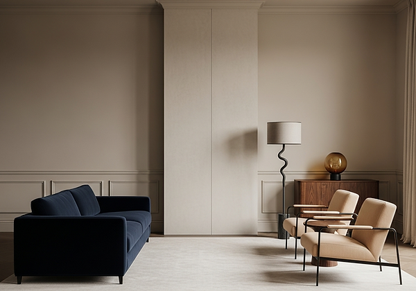
Balance in interior design can be achieved through various methods, each imparting a distinct character to the space:
-
Symmetrical (Formal) Balance:
-
Definition: Achieved through the mirrored arrangement of identical or very similar elements around a central axis (real or imaginary). If you draw a line through the middle of the composition, both sides are identical.
-
Application: Think of a grand fireplace flanked by two identical armchairs, matching side tables, and twin lamps.
-
Impact: Creates a strong sense of formality, order, calm, and tradition. It is often associated with classical, traditional, or highly structured aesthetics, conveying a feeling of grandeur and stability. Its predictability can be profoundly restful [Pile, 2013].
-
-
Asymmetrical (Informal) Balance:
-
Definition: Involves the strategic placement of dissimilar elements that nonetheless possess equivalent visual weight. The two sides of the composition are not identical, but their overall visual weight is balanced.
-
Application: A large sofa (heavy visual weight) on one side of a fireplace might be balanced by two smaller, lighter armchairs, a tall floor lamp, and a console table on the opposite side. The elements are different, but their combined presence feels equal.
-
Impact: Offers a more dynamic, natural, and contemporary feel. It is often perceived as more engaging, casual, and visually interesting than symmetrical balance because it requires the eye to work slightly harder to perceive the equilibrium. It feels less rigid and more organic [Wong, 1993].
-
-
Radial Balance:
-
Definition: Elements radiate outwards from a central point, generating a sense of outward movement and focus.
-
Application: A round dining table with chairs evenly spaced around it, or a circular chandelier with lights radiating outwards. A spiral staircase is another excellent example.
-
Impact: Creates a strong sense of unity, focus, and dynamism, drawing attention to the centre. It fosters a feeling of inclusivity and connection, as all elements are oriented towards the core.
-
Significance: The choice of balance type depends on the desired mood and aesthetic. Formal spaces often benefit from symmetry, while more relaxed or modern environments might favour asymmetry or radial arrangements.
Achieving optimal balance requires a meticulous eye for detail and a comprehensive understanding of how all design elements contribute to visual weight. It's an iterative process of evaluation and adjustment.
-
The floor plan as a blueprint for balance: Our initial spatial planning is crucial. Before selecting furniture, we map out zones and potential placements, assessing how major pieces will distribute weight across the room. We consider sightlines and how a composition will appear from various entry points.
-
Strategic furniture selection: We carefully choose furniture pieces not only for their aesthetic appeal and comfort but also for their perceived visual weight. A solid, dark piece of furniture will carry more weight than a visually lighter, airy piece made of glass or chrome, even if they occupy similar physical space.
-
Leveraging colour and texture: As discussed in previous sections, darker colours and richer, more pronounced textures carry more visual weight. We use this understanding to balance lighter elements. For example, a single dark, heavily textured wall can balance a larger area of lighter, smoother walls on the opposite side.
-
Art and accessories as balancing tools: Artwork, mirrors, and decorative objects are invaluable for fine-tuning balance. A large, bold piece of art can provide significant visual weight to balance a grouping of furniture. Conversely, a series of smaller objects can collectively balance a single, larger element.
-
Considering vertical balance: Balance isn't just horizontal. We consider how elements distribute visual weight vertically. A tall, imposing piece of cabinetry might be balanced by a series of horizontal architectural details lower on an opposite wall, or by the visual weight of a seating arrangement that anchors the lower portion of the room.
-
Avoiding over-weighting: A common error is to concentrate too much visual weight in one area, leading to a cramped or uncomfortable sensation. Conversely, too little visual weight results in a space that feels sparse and unfinished. The goal is a comfortable equilibrium.
Significance: A balanced room feels inherently restful, harmonious, and intentionally composed. It provides a sense of psychological comfort and allows the eye to effortlessly navigate the space, enhancing overall aesthetic appreciation and functional ease. It is the underlying structure that enables a design to feel inherently 'right'.
Balance, whether achieved through formal symmetry, dynamic asymmetry, or radial composition, is the bedrock of visual stability in interior design. It is the art of orchestrating disparate elements so that they coexist in perfect equilibrium, creating spaces that feel inherently settled, coherent, and profoundly comfortable.
Having explored the fundamental principles that establish static stability—Line, Shape, Form, Colour, Texture, Space, and Balance—we now delve into the principle that breathes life and dynamism into an interior: Rhythm.
1. Understanding Visual Weight: Beyond Physical Mass
2. Types of Balance: Achieving Equilibrium
3. Practical Application: Orchestrating Balance for Impact
Part 2: The Core Principles of Design:
The Language of Space
2.6. Rhythm: Guiding the Eye Through the Space
Imagine the soothing cadence of waves lapping the shore, or the measured beat of a favourite piece of music. These natural and artistic phenomena possess a sense of ordered movement, a predictable flow that guides our perception and evokes a feeling of ease. This same principle, applied to interior design, is Rhythm. It is the recurrence or alternation of elements that creates a sense of organised movement for the eye through a room, encouraging visual exploration and establishing a distinct cadence.
Rhythm is the conductor of the visual orchestra within a space. It prevents monotony, fosters a sense of unity, and ensures that the eye is guided gracefully from one point of interest to the next, rather than wandering aimlessly or being overwhelmed. When rhythm is masterfully applied, a room doesn't just exist; it flows, it dances, it invites you on a silent, harmonious journey.
Rhythm in design is about creating a visual pulse, a predictable sequence that leads the eye. It is the underlying structure that provides vitality and a sense of progression to a composition. Without rhythm, a space can feel static, disjointed, or chaotic, lacking the inherent dynamism that makes it truly engaging. It's the design equivalent of a well-composed piece of music, with carefully placed beats and melodies.
-
Impact: Rhythm imbues a space with energy, coherence, and a compelling sense of narrative. It encourages sustained visual engagement, transforming a series of individual elements into a unified, flowing experience.
Rhythm can be orchestrated in several distinct ways, each imparting a specific character and velocity to the visual journey through a space:
-
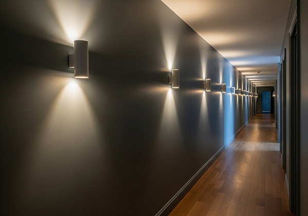
Repetition:
-
Definition: The simplest and most direct form of rhythm, achieved by consistently repeating a specific element such as a colour, texture, shape, line, or module at regular intervals.
-
Application: Imagine a series of evenly spaced wall sconces down a corridor, or the consistent use of a particular wood finish on furniture pieces throughout a room. A repeating pattern on wallpaper or fabric is another prime example.
-
Impact: Creates a strong sense of unity, order, and predictability. It provides a visual beat that is inherently calming and reassuring, offering a clear, predictable path for the eye. [Ching, 2014]
-
-
Progression (Gradation):
-
Definition: Involves the gradual increase or decrease of one or more visual attributes of an element. This creates a sense of movement towards a climax or resolution.
-
Application: A series of framed artworks increasing in size along a wall, drawing the eye towards a focal point. A gradation of colour from light to dark on successive wall panels. A spiral staircase where the steps progressively narrow or widen.
-
Impact: Creates a dynamic, often dramatic, sense of movement and visual tension, leading the eye along a defined, escalating path. It can add depth and a narrative quality.
-
-
Alternation:
-
Definition: The interplay of two or more distinct elements in a repetitive sequence, creating a predictable, back-and-forth visual pattern.
-
Application: Alternating dark and light floor tiles. A sequence of a solid panel followed by a textured panel on a wall. A dining setting alternating two different chair styles.
-
Impact: Offers more visual interest than simple repetition, providing a lively yet still orderly cadence that keeps the eye engaged without being chaotic.
-
-
Transition:
-
Definition: A smooth, continuous line, form, or visual quality that guides the eye seamlessly from one element or area to another. It implies a flowing connection rather than a stark break.
-
Application: An arched doorway leading gracefully into another room. A low, sweeping sofa or a continuous custom bench seating that encourages the eye along its curve. A continuous piece of moulding or a dado rail running uninterrupted around a room.
-
Impact: Creates a sense of elegance, fluidity, and connection. It promotes a natural, effortless flow, both visually and physically, throughout a space.
-
-
Contrast (Juxtaposition):
-
Definition: Placing two opposing elements side-by-side to create visual energy and prompt the eye to jump between them, thus implying movement. While discussed in "Contrast," it serves rhythm by disrupting monotony.
-
Application: A rough, organic material next to a sleek, polished one. A vibrant piece of art on a muted wall.
-
Impact: Adds visual energy and prompts the eye to move between disparate elements, creating a dynamic rhythm.
-
Significance: The judicious application of these rhythmic techniques prevents a space from feeling static or overwhelming. They ensure that the interior feels purposeful, guiding the inhabitant through its story with grace and intention.
Implementing rhythm effectively requires a nuanced understanding of how all design elements contribute to the visual flow. It's an intentional choreography of form, light, and space.
-
Architectural Features: Inherent elements like a series of arched doorways or repeating columns naturally establish rhythm. Designers can enhance this by repeating colours or finishes on these features.
-
Furniture Placement: A sequence of identical dining chairs along a long table creates a powerful sense of repetition. Arranging a series of armchairs or poufs at consistent intervals in a large living space can also establish rhythm and define conversational zones.
-
Lighting Design: As seen with wall sconces, repeating light fixtures along a wall or ceiling creates visual rhythm. Similarly, the consistent spacing of recessed downlights or the patterned glow of strategically placed table lamps can guide the eye and add depth.
-
Flooring Patterns: The repetition of tiles, planks, or even distinct patterns within a rug can create a strong rhythmic pulse that influences how the eye moves across the floor plane.
-
Textiles and Wallcoverings: Patterned wallpapers or fabrics with a repeating motif establish rhythm on vertical surfaces, adding dynamism and visual interest.
-
Art and Accessories: A gallery wall featuring a consistent frame style or spacing, or a collection of similar objects displayed in a repetitive sequence on shelves, can introduce effective rhythm without requiring large structural changes.
Significance: Rhythm breathes vitality into a space. It ensures that the eye is never overwhelmed but rather invited to explore the entire composition with a sense of purpose and discovery. A room with masterful rhythm feels alive, harmonious, and effortlessly engaging.
Rhythm is the unseen conductor of visual harmony in interior design. It transforms static elements into a dynamic composition, guiding the eye through a deliberate, captivating journey. By orchestrating repetition, progression, alternation, and transition, designers create spaces that possess an innate vitality, coherence, and profound sense of flow.
Having explored the principles that govern stability and movement within an interior—Line, Shape, Form, Colour, Texture, Space, Balance, and Rhythm—we now turn our attention to the principle that commands attention and anchors the entire composition: Emphasis (Focal Point).
1. Understanding Visual Movement: The Cadence of Design
2. Types of Rhythm: Orchestrating the Visual Flow
3. Practical Application: Orchestrating Rhythm for Dynamic Spaces
Part 2: The Core Principles of Design:
The Language of Space
2.7. Emphasis (Focal Point): Guiding the Eye in Your Interior Design
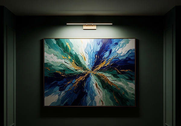
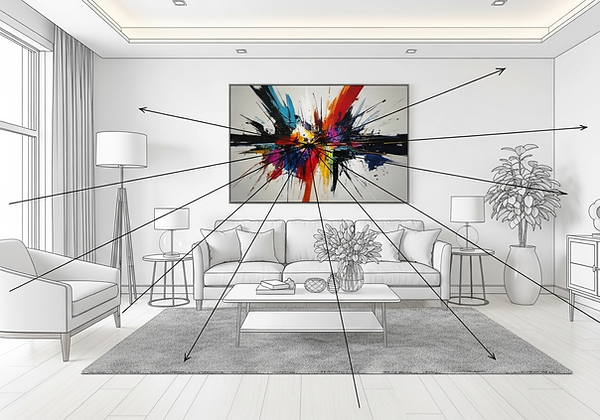
Imagine walking into a room. Your gaze doesn't wander aimlessly. Instead, your eye is subtly, almost imperceptibly, drawn to a specific element. It lingers there for a moment before gracefully moving to explore other details. This deliberate journey is the result of a masterful application of Emphasis and Focal Points – fundamental principles that dictate how we visually experience an interior.
Emphasis, in design, is the technique of making one element or area stand out more prominently than others. A Focal Point is the specific element itself that commands this attention, acting as a visual magnet that anchors the space and provides a starting point for visual exploration. These are not merely decorative choices; they are strategic design decisions that establish hierarchy, create visual interest, and guide the narrative of the space. At Gianna D'Art, we understand that a powerful focal point is the anchor of a harmonious room, providing clarity, purpose, and compelling allure in every composition.
The human eye and mind inherently seek order, organization, and points of interest within a complex visual field. This psychological predisposition is foundational to how we process space [Arnheim, 1974]. Without a defined focal point, a room can feel chaotic, cluttered, or simply bland—a collection of equally important elements that compete for attention, leading to visual fatigue and a sense of aimlessness.
A well-established focal point achieves several critical objectives within an interior:
-
Establishes Hierarchy: It tells the eye where to look first, providing a clear starting point for visual exploration and dictating the order in which other elements are perceived.
-
Creates Visual Interest: It acts as a magnet, drawing attention, sparking curiosity, and creating a sense of drama or intrigue. It prevents a room from feeling monotonous.
-
Anchors the Space: It provides a central point around which other design elements can relate and be grouped, contributing to overall balance and unity [Lauer & Pentak, 2012]. It gives the room a sense of purpose and direction.
-
Defines Purpose and Character: It can subtly communicate the primary function or unique character of a particular area within a larger room, even in open-plan spaces.
Significance: A thoughtfully established focal point grounds the design, offering a point of visual repose and initiating a curated visual journey throughout the interior.
Focal points can arise naturally from the existing architecture of a space or be intentionally introduced through design interventions. Understanding both types allows for a more strategic approach to emphasis.
-
Inherent/Architectural Focal Points: These are built-in features that naturally command attention due to their size, position, or inherent architectural detail. They are often the easiest and most powerful focal points to work with. Common examples include:
-
A grand fireplace with an elaborate mantelpiece.
-
A large bay window offering a stunning view of a garden, cityscape, or natural landscape.
-
Built-in bookshelves, bespoke cabinetry, or a media wall that integrates seamlessly with the room's structure.
-
A striking arched doorway or a series of columns.
-
-
Created Focal Points: These are elements introduced by the designer when a room lacks a strong inherent architectural interest, or when a secondary point of emphasis is desired. They require deliberate design techniques to draw attention.
Significance: Identifying inherent focal points early in the design process is crucial, as they often dictate furniture placement and overall room layout. Where they are absent, designers employ creative techniques to establish them.
When inherent focal points are absent, or when a secondary point of interest is desired to add layers of intrigue, designers employ a range of sophisticated techniques to create compelling emphasis:
-
Strategic Placement: The simplest yet most effective method. Placing a significant object centrally, at the end of a clear sightline, or directly opposite a main entrance naturally draws the eye. A key piece of furniture or art positioned with ample negative space around it immediately establishes its importance.
-
Contrast: This is one of the most powerful and immediate methods for creating emphasis, as it exploits the eye's natural tendency to notice differences [Wong, 1993]. A focal point stands out because it differs significantly from its surroundings in one or more visual attributes:
-
Colour: A bold, saturated piece of art on a neutral wall, a single accent wall painted in a vibrant hue, or an armchair in a striking, complementary colour within an otherwise serene room.
-
Texture: A raw, reclaimed wood mantelpiece against a smooth, plastered wall; a plush velvet sofa contrasting with a room of crisp linens and hard surfaces. The tactile difference creates visual pull.
-
Form/Shape: A unique, sculptural chandelier with organic curves in a room dominated by rectilinear furniture; a bold geometric pattern on a rug in an otherwise understated space.
-
Scale: An object that is purposefully larger than its immediate surroundings, or unusually proportioned in a captivating way, can become a focal point. An oversized piece of abstract art or a dramatically scaled mirror commands attention by its sheer presence.
-
-
Lighting: Direct, deliberate illumination is an immensely powerful tool for emphasis. A precisely aimed spotlight on a painting, a linear LED strip highlighting a textured feature wall, or a glowing pendant light suspended over a key object can immediately draw the eye and create a dramatic, gallery-like effect [Flynn et al., 1973]. Light can sculpt and define.
-
Unique or Novelty Elements: An unexpected or unusual object—a rare antique, a piece of found art, a custom-designed furniture piece, or a striking architectural fragment—can become a compelling focal point simply by virtue of its distinctiveness, intrigue, and inherent story.
-
Grouping and Repetition: While repetition can create rhythm, a cluster of similar items (e.g., a gallery wall of many framed photos) can collectively create a larger focal point. Grouping furniture around a central element (like a coffee table or a striking rug) also emphasizes that central point.
Significance: These techniques allow designers to intentionally guide the visual hierarchy of a room, ensuring key elements are highlighted and the overall composition feels purposeful and engaging.
While a single, dominant focal point is generally advisable to prevent visual confusion and ensure clarity, a sophisticated interior design can effectively incorporate secondary focal points. These are smaller, less prominent areas of interest that complement the primary one, adding layers of intrigue and visual richness without competing for absolute attention.
-
Orchestration is Key: The primary focal point should always be the strongest, commanding the initial and most significant attention. It is the room's undeniable star.
-
Complementary Roles: Secondary focal points play a supporting role. They might be achieved through:
-
Smaller groupings of curated objects on a console table.
-
Intimate lighting vignettes (e.g., a beautiful table lamp illuminating a specific reading corner).
-
Minor architectural details that are subtly highlighted (e.g., a unique door handle or a small built-in display shelf).
-
A piece of furniture that is beautiful in its own right but not as visually commanding as the primary focal point.
-
Visual Flow: When multiple focal points exist, the eye should naturally move from the primary focal point to the secondary ones, then effortlessly explore the rest of the room. This creates a cohesive and engaging visual journey, revealing layers of design as the eye progresses through the space.
-
Significance: Incorporating secondary focal points adds depth and complexity, preventing a room from feeling too static or too focused on a single element, and encourages prolonged visual engagement.
The strategic creation and orchestration of emphasis and focal points are central to designing interiors that are not only beautiful but also compelling, intuitive, and engaging to experience. It’s about more than just placing aesthetically pleasing objects; it’s about crafting a visual narrative, guiding the eye, and ultimately, ensuring that every element in your home serves a purposeful role in the grand design.
By understanding how to draw attention with intention, we transform rooms from static collections of décor into dynamic, layered, and deeply personal spaces, each telling its own captivating story. This is the art of thoughtful curation and the science of compelling visual communication.
Having systematically explored the foundational grammar of design in Part 2: The Core Principles of Design, we now transition from theory to practice, moving into the meticulous, yet profoundly rewarding, journey of bringing a vision to life.
Congratulations! You have now completed Part 2 of our
Ultimate Guide to Interior Design. Part 3 - 7 will be published later this year.
1. The Psychological Imperative: Why Focal Points Matter
2. Types of Focal Points: Inherent vs. Created
3. Techniques for Creating Powerful Emphasis
4. The Symphony of Focal Points: Primary and Secondary